SMF Themes
Themes that specifically work on SMF.
2 files
-
mixed Clair de Lune
By Arceus
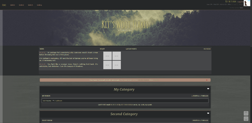
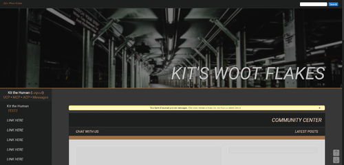
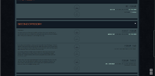
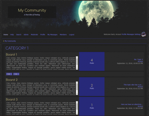
I present Clair de Lune, a feature-rich, mobile-responsive theme for SMF. This theme is full of features and has several configurable options, most of them changeable directly in the admin CP. There is a lot to this theme, it's almost like getting three themes in one. Most front-facing templates are altered and made pretty. Sorry for so many screenshots, but this is all three variations, plus the mobile stuff.
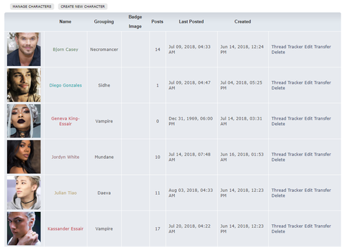
Three colour-scheme theme variants: light, dark, balance (dark with light content areas). This should mean any given user on your site has at least one variant they can easily read and look at for long periods of time. Configurable board stats display of member group counts of your choosing. Simply input a member group's ID in the box, in a comma separated list, to display it and the number of accounts in that group in the board stats automatically. They will show in the order you input them in. Configurable board sub-title that shows in the banner, if you choose to use it. The banner titles will go from being floats to the side of the banner, to being docked to the bottom of the banner image, on mobile. Configurable board index layout. By default, Clair de Lune has a traditional row-style board layout. You can input category IDs in a box to switch the board display for that category to a two-column grid layout. Fully mobile responsive. Mobile devices see a rearrangement of varying elements, collapsing of unnecessary elements, and special mobile menu popups for the main menu, topic and post options, and moderation options for staff. Grid layouts are all built with flex-box CSS, meaning they will resize themselves accordingly based on screen size, even not on a mobile device. Bootstrap tabs in the profile layout. As these are styled, you can simply copy-paste these tab elements anywhere on the site to create more in another location. Profile template has a tab for the last 10 posts made by a user, to view on the fly, without loading the post list page in user stats. First tab on the profile auto-plugs in the custom profile fields. Slick, pretty-looking select-box style drop menu for member list sort options. No ugly column headers, here! Disabling a field will cause it to not appear in the drop-down menu for member list sorting. Enable tabbed member list boxes, to automatically generate a tabbed member list entry layout. Each member box will have a user tab and a character tab. The character tab default lists out both subaccounts, and character accounts, if the board's using the Character Manager for SMF. Note, the links are set up for ACM2. If your board is using ACM1, you'll need to manually change the link structure in the Memberlist.template.php. Check a box in the ACP to collapse poster info bits to just avatar, title, and personal text, making the poster info smaller and sleeker with no template changes. Built-in three column, mobile responsive top-box. Editable in the index.template.php, enable by uncommenting it in the BoardIndex.template.php (this placement ensures it only shows on the board index, rather than globally). Uses language strings wherever possible, so it should work with other, non-English language packs. Barring that one stupid quick edit button, because SMF uses an image for that, not a language string. Quick edit button is not an ugly image. Upward arrow appears when scrolling down past a point; this will gently glide the user back to top when clicked. Unread PMs cause the user PM link to turn hot pink. Stats page and recent posts page are both styled decently. Polls, attachments, currently viewing, board descriptions within boards, are also styled nicely. Topics will display topic starter's avatar, name, and link, in the topic header. Member group colour is automatically used in several places across the topic display, profile, and member list. There is no configuration needed to get it working, it should automatically if you have group colours input correctly. Comes with jQuery, bootstrap, and FontAwesome 5 free, ready to be used across the site. Main font families used are Comfortaa and Tahoma. I am blind. I can read it. I recommend not lowering the font size much, if at all, or it will become unreadable to a select group of blind people (like me), and people with ridiculously large screens.
What you can edit:
Main background images. Header images. Add new fields, such as custom fields, to the poster info section. Add tabs to the profile template. Rearrange the tabs. Add new information to existing tabs. Alter the top box. Of course. Any edits that are required for modifications to work. Character tab in the member list may be changed; it is just a comma separated list of links by default, if you want something fancier, you'll have to do it yourself. Accent colour changes. Font family changes. If you're using this theme, I don't want to see you pulling your entire $memberContext array on it just to pull an avatar. So there's actually an example of how to pull an avatar using a member ID at the bottom of the Display.template. The function's called arcLoadStarter(), and it will work whether the image is uploaded as an attachment, linked, or in a custom avatar folder. Love it. Emulate it. Copy it as is and change some stuff to make it work, I don't care, but don't be pulling the monster array for one thing.
Known bugs:
While quick-edit of the post message icon will change the icon, it doesn't change the one that's displayed without a page reload. Unfortunately, SMF's scripting for topic functionality is fucking stupid and I cannot figure out why it broke this time, so I gave up. If I ever figure out why, I'll release a new version of Clair de Lune. In the interim, just know it does work even though it acts like it doesn't. This isn't really a bug, but, the accent colours are blue and gold. The particular shade of blue is a very desaturated blue, and can appear purple on some monitors and to some eyes. That doesn't change the fact it's smack in the middle of blue on the colour wheel, howbowdah. P= (Inside joke, sorry.)
Buying this theme means I will help you fix it if you break it, and will also help you get mods working on it if you need help with that. Beyond that, this theme is provided as-is.
Background patterns were generated from Pattern Cooler. I think.
2 downloads
(0 reviews)0 comments
Submitted
-
Light Theme Curve Without Stupid [Barebones]
By Arceus
Welcome to Curve Without Stupid, now featuring a lack of Stupid!
This theme is completely and entirely ripped apart so you guys can use it as a theme base (and it's a much better one than Curve itself). There is only enough CSS to make SMF 2.0 do its thang and stop being Broke, some bonus flex-box CSS for a thing to show y'all how to do it, and that's it. Everything you need is in the files themselves, riddled with commentary. Thereby! The real value of this theme is in its commentary! Yaaaay, listening to me whine about how dumb SMF's default theme is!!
More seriously, the commentary in the CSS and the template files that are included will be of grand, immeasurable use to you as a budding SMF themer. I go into what does what, what arrays have what information, where to find this, where one thing starts and where it ends, what CSS classes are default, etc, etc, etc. The idea is, you can tackle building an SMF theme from the ground up without all the headache of "WHERE IS THIS - WHY IS THIS????" because, oh, my dear padawan, I feel you hardcore. If you're impatient, you can go ahead and start playing with this theme right now; otherwise, you can hang onto it/keep it in mind for when the "So You Want to Theme SMF?" guides start getting dropped (because it will essentially tell you to rip a bunch of stuff out, anyway, and I'm doin' that guide loves, I promise I am, but I have to make Sense of Nonsense). Currently Curve Without Stupid comes with the index.template.php file, BoardIndex.template.php file, and the Display.template.php file. Coming soon: Curve Without Stupid + Memberlist.template.php and Profile.template.php.
I make no promises that actual Curve will ever make sense to you. It may never. I also make no promises that mods can automatically install themselves on a theme made with this barebones as a base, it's more likely to fail trying because mods like to use default commentary, and I ripped it all out. I don't ask for credits on anything you make from this. If you feel kind, go ahead (Built on CWS by Arceus of The Initiative is fine), but don't worry about it if you don't want to (it's legit just a stripped version of the default theme, so it's not really like I did a lot). Have fun, and show me what you make! I like pretties!
This one is only for SMF 2.0.x. I will have a Curve2 Without Stupid someday. That day is not today. xD (I will also be making actual premade themes, both for 2.0 and 2.1, promise.)
15 downloads
-
Download Statistics
18
Files20
Comments15
Reviews


![More information about "Curve Without Stupid [Barebones]"](https://rpginitiative.com/screenshots/monthly_2018_08/curvewithoutstupid.thumb.png.9e70c06cab25d1f71bf81dcf9851a4e7.png)
